Pareto Chart
Pareto Chart is based on the Pareto principle (also known as the 80/20 rule), which is a well-known concept in project management.
According to this principle, ~80% of the problems can be attributed to about ~20% of the issues (or ~80% of your results could be a direct outcome of ~20% of your efforts, and so on..).
The 80/20 percentage value may vary, but the idea is that of all the issues/efforts, there a few that result in maximum impact.
This is a widely used concept in project management to prioritize work.
Creating a Pareto Chart in Excel (Step by Step)
In this tutorial, I will show you how to make a:
- Simple (Static) Pareto Chart in Excel.
- Dynamic (Interactive) Pareto Chart in Excel.
Creating a Pareto Chart in Excel is very easy.
All the trickery is hidden in how you arrange the data in the backend.
Let us take an example of a Hotel for which the complaints data could look something as shown below:
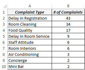
NOTE: To make a Pareto chart in Excel, you need to have the data arranged in descending order. If your data is not in descending order then sort it in descending order first.
Creating a Simple (Static) Pareto Chart in Excel
Here are the steps to create a Pareto chart in Excel:
- Set up your data as shown below.
2. First Calculate the % Contribution & then Calculate cumulative % in Column
C. Use the below following formula:
For % Contribution =SUM(B2/SUM($B$2:$B$10)*100
For cumulative %, =C2 in first column, =C3+D2 in 2nd column and then drag 2nd column till 10th column. (if it is right it shall come 100% in last column).
3. Select the entire data set (A1:C10), go to Insert –> Charts –> 2-D Column –> Clustered Column. This inserts a column chart with 2 series of data (# of complaints and the cumulative percentage).
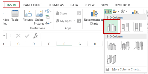
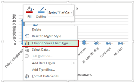
4. Right click on any of the bars and select Change Series Chart Type.
5. In the Change Chart Type dialogue box, select Combo in the left pane.
6. Make the following changes:
(a) # of Complaints: Clustered Column.
(b) Cumulative %: Line (also check the Secondary Axis check box)
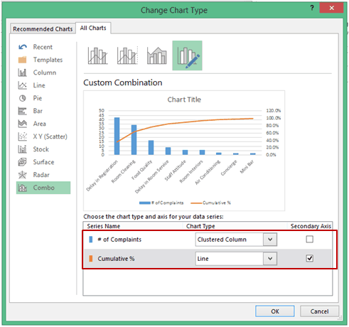
[If you are using Excel 2010 or 2007, it will be a two-step process. First, change the chart type to a line chart. Then right click on the line chart and select Format Data Series and select Secondary Axis in Series Options]
7. Your Pareto Chart in Excel is ready. Adjust the Vertical Axis values and the Chart Title.
How to Interpret this Pareto Chart in Excel
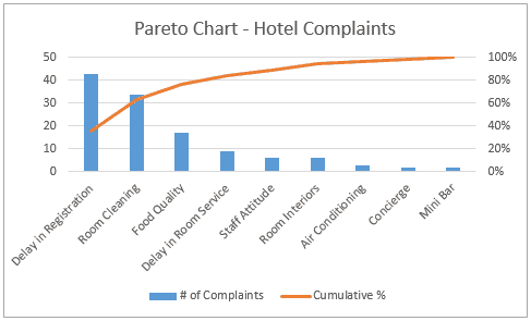
This Pareto chart highlights the major issues that the hotel should focus on to sort the maximum number of complaints. For example, targeting first 3 issues would automatically take care of ~80% of the complaints.
For example, targeting the first 3 issues would automatically take care of ~80% of the complaints.
Creating a Dynamic (Interactive) Pareto Chart in Excel
Now that we have a static/simple Pareto chart in Excel, let’s take it a step further and make it a bit interactive.
Something as shown below:
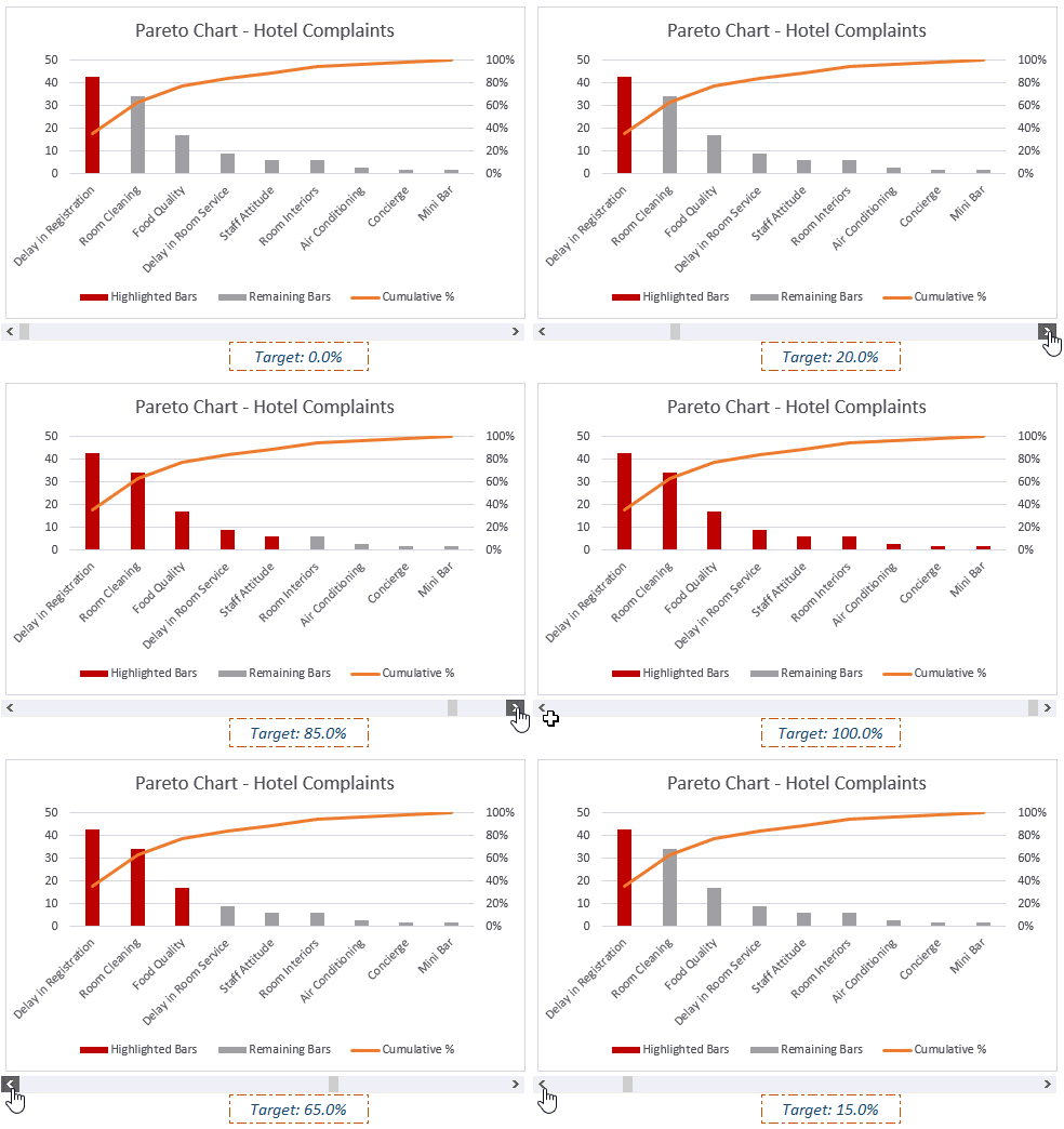
In this case, a user can specify the % of complaints that need to be tackled (using the excel scroll bar), and the chart will automatically highlight the issues that should be looked into.
The idea here is to have 2 different bars.
The red one is highlighted when the cumulative percentage value is close to the target value.
Here are the steps to make this interactive Pareto chart in Excel:
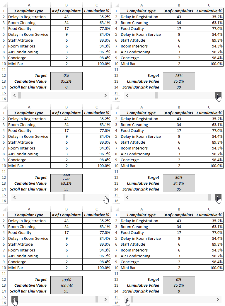
- In cell B14, I have the target value that is linked to the scroll bar (whose value varies from 0 to 100).
2. In cell B12, I have used the formula =B14/100. Since you cannot specify a percentage value to a scroll bar, we simply divide the scroll bar value (in B14) with 100 to get the percentage value.

3. In cell B13, enter the following combination of INDEX, MATCH, and IFERROR functions:
=IFERROR(INDEX($C$2:$C$10,IFERROR(MATCH($B$12,$C2:$C$10,1),0)+1),0)This formula returns the cumulative value that would cover the target value. For example, if you have the target value as 70%, it would return 77%, indicating that you should try and resolve the first three issues.
=IFERROR(INDEX($C$2:$C$10,IFERROR(MATCH($B$12,$C2:$C$10,1),0)+1),0)This formula returns the cumulative value that would cover the target value. For example, if you have the target value as 70%, it would return 77%, indicating that you should try and resolve the first three issues.
- In cell D2, enter the following formula (and drag or copy for all cell – D2:D10):
=IF($B$13>=C2,B2,NA()) - In cell E2 enter the following formula (and drag or copy for all cell – E2:E10):
=IF($B$13<C2,B2,NA()) - Select the Data in Column A, C, D & E (press control and select using mouse).
- Go to Insert –> Charts –> 2-D Column –> Clustered Column. This will insert column chart with 3 series of data (cumulative percentage, the bars to be highlighted to meet target, and remaining all other bars)
- Right-click on any of the bars and select Change Series Chart Type.
- In the Change Chart Type dialogue box, select Combo in the left pane and make the following changes:
(b) Highlighted Bars: Clustered Column.
(c) Remaining Bars: Clustered Column.
10. Right-click on any of the highlighted bars and change the color to Red.
That’s It!
You have created an interactive Pareto Chart in Excel.
Now, when you change the target using the scroll bar, the Pareto chart would update accordingly.
Do you use the Pareto Chart in Excel?
I would love to hear your thoughts on this technique and how you have used it. Do leave your footprints in the comments section 🙂


No comments:
Post a Comment